EDA_python
Introduction
![]()
EDA_python is the new batch analysis software from Elements. It is entirely written in Python and open source. Currently EDA_python supports the following operations:
In the next few pages we’ll take a quick look at these functionalities. One of the objectives with the realization of this software was the possibility to apply the same transformation to an opened file and the possibility to come back to previous states of the analyzed signal.
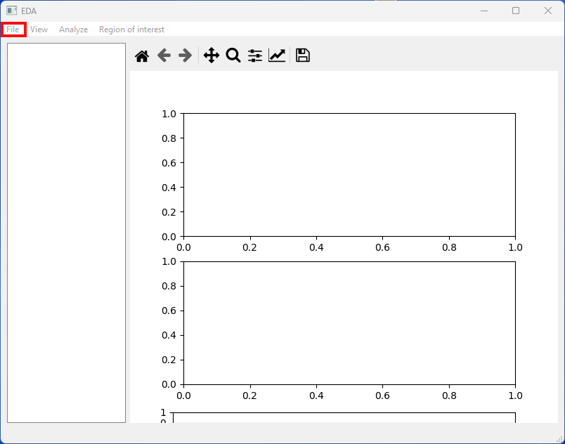
Open files
Currently EDA_python supports the reading of two data types:
- ABF
- EDH
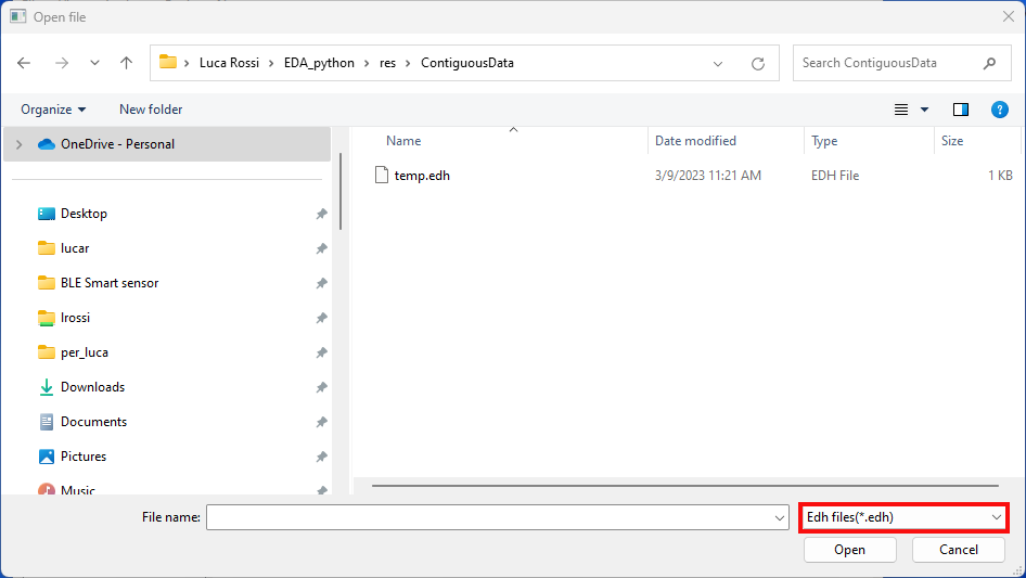
To open one of these two files simply click on “File” → “Open” or use the shortcut key “ctrl+O”.
The app will default to edh files but you can open abf by simply changing the file extension from the dropdown menu of the file browser.
Export Files
Currently EDA_python supports the exportation to the following files:
- CSV
To export the current plot simply click on “File” → “Export” and then select the file extension, choose a suitable name for your file and save it.
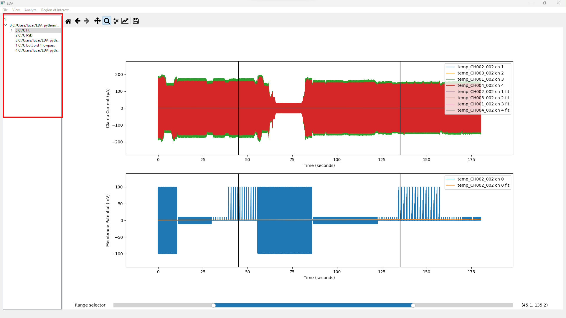
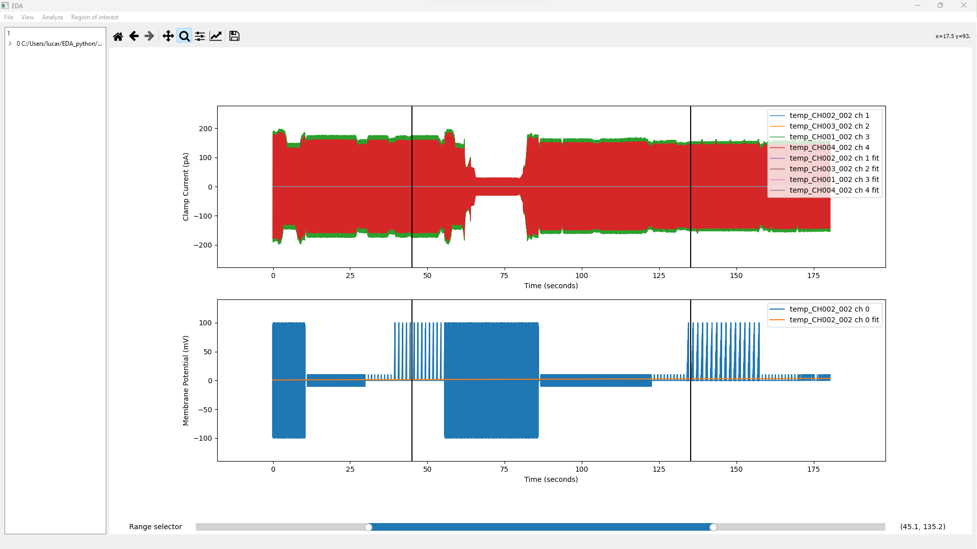
Plot Navigation
To navigate the plot you can use the provided toolbar shown in the following image:
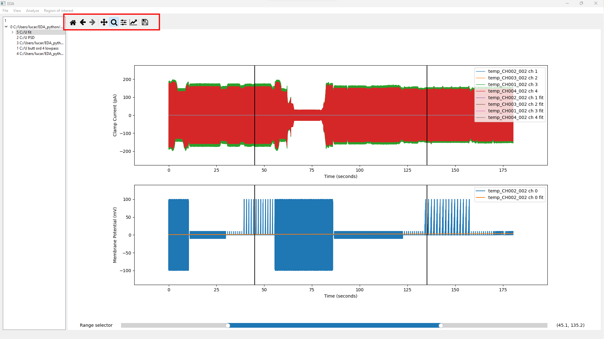
To have a detailed explanation of the possible operations you can take a look to the official documentation at the following link: Interactive navigation — Matplotlib 3.2.2 documentation
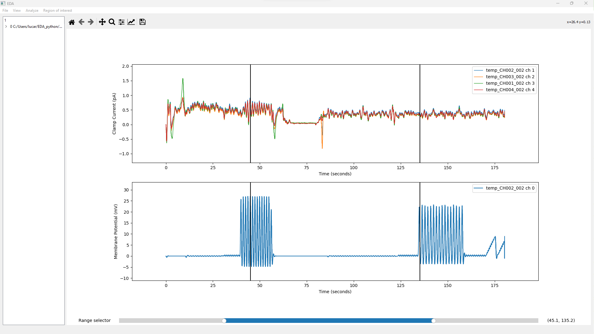
Almost every operation performed on a plot will yield a new plot and will be nested, for example if you filter a raw data, the raw data will produce a “child” that will be displayed by default. You can pass to the desired state in every moment by double clicking on the state you want.
Analysis
Currently EDA_python support the following analysis:
- Filters
- Spectral Analysis
- Histogram
- Dwell Analysis
- Fitting All these analyses can be found in the main menu under the “Analyze” section. We’ll now take a look at them one by one.
Filters
To apply a filter to the current plot click on “Analyze” → “Filters”, a new widget will appear with a sample filter. From here you’ll be able to create your own filter by changing the options in this menu.
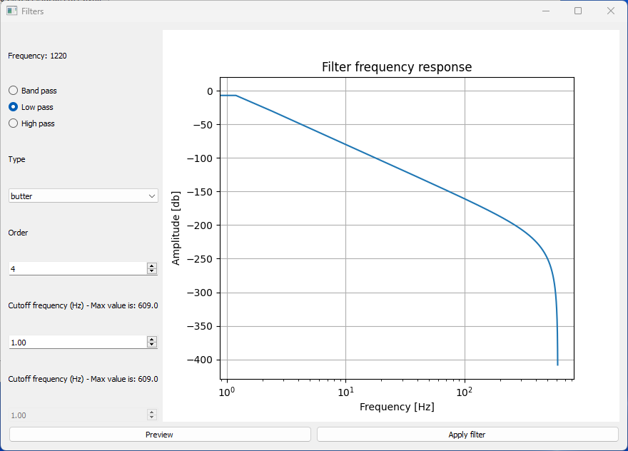
To see a preview of the filter that will be applied click on the preview button and the line of the filter will be updated with the filter created from the new parameters.
To apply the filter to the current plot simply click on the Apply filter button.
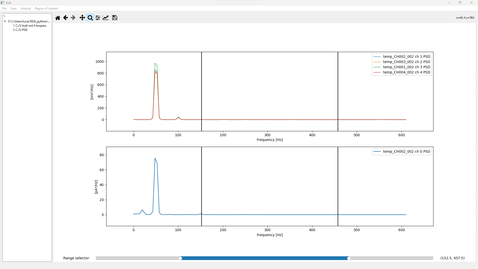
Spectral Analysis
To have the power spectral density of the current plot simply click on “Analyze” → “Spectral analysis”.
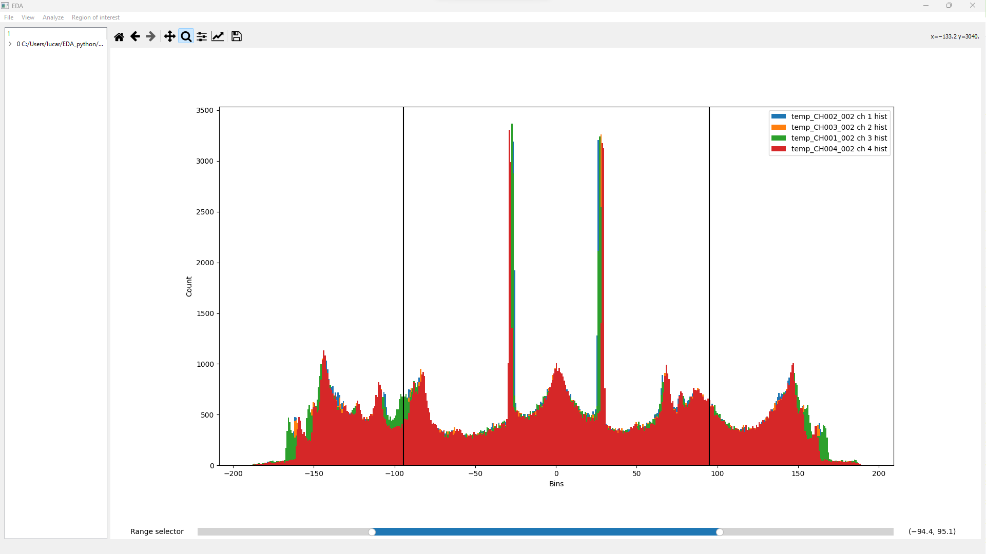
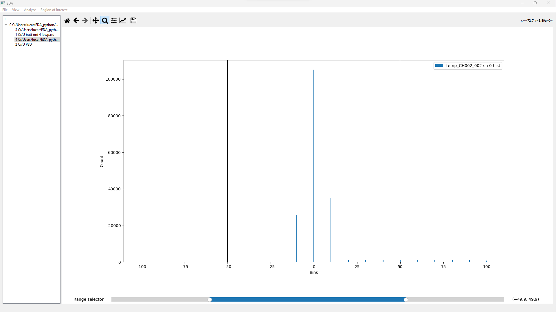
Histogram
To get the histogram of the current plot simply click on “Analyze” → “Histogram”. This operation will create two different plots: one for the current and one for the voltage (if your plot has a current plot and voltage plot).
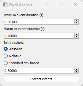
Dwell Analysis
From this situation you can select “Analyze” → “Dwell Analysis” A widget like the one in the following figure should appear.
Set the desired value (input_value) and a strategy to build the threshold that will be used to extract the events, in particular you can choose between three options:
- Absolute: Extract events using the given input_value as the threshold
- Relative: A baseline (baseline) is calculated and the threshold is baseline + input_value
- Standard dev based: A baseline (baseline) and the standard deviation are calculated (std_dev) and the threshold is **baseline + std_dev * input_value **
Extracted events
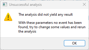
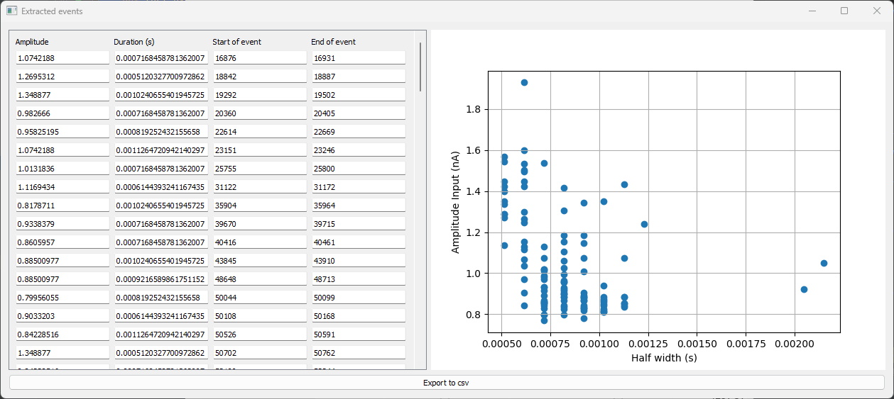
The dwell analysis can yield two different results:
- A warning: The analysis with the current parameters could not find any event. An example can be found in the following image.
- A widget: The widget would have a structure similar to the following, in particular it will summarize the found events. For each event an amplitude, a duration and the point of start and end will be displayed. From this widget it is also possible to extract the parameters in csv.
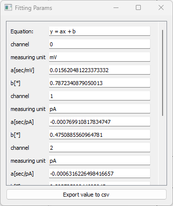
Fitting
With EDA_python you can find the curve that better approximates the given plot. Currently EDA_python supports the following types of curves:
- Linear
- Quadratic
- Exponential
- Power Law
- Gaussian
- Boltzmann sigmoid
To make fitting analysis click on “Analyze” → “Fit” and choose the equation that will be used to approximate the plot.
WARNING: The approximation will be applied to the whole plot, if you only need to apply it on a portion of the plot consider the creation of a “Region of interest”
Once applied, the analysis will yield a new plot with the new lines and a widget will appear with the result of the analysis, in particular the widget will show the found parameters and the equation. You can then export these parameters to csv for further investigation.
Region of Interest
EDA_python currently supports the following methods to create a region of interest:
- Create ROI option (uses cursors)
- Advanced ROI The Create ROI options make use of the cursor located in the bottom of the screen. You can drag the slider to change the position of the vertical lines. To create a region of interest click on “Region of interest” → “Create ROI”, a new plot will be generated from the data between the two vertical lines.
To have more control over the Region of interest that you want to create simply click on “Region of interest” → “Advanced ROI”. A new widget will appear like the one in the following image.
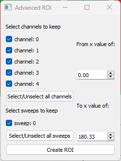
Select the channel/sweeps that you want to keep and the portion of the x values then click on the “Create ROI” button to get the new plot.